Introduction
We live in a world that prioritizes mobile devices. People spend hours scrolling, searching, and shopping on their smartphones. If your website isn’t mobile-friendly, you’re leaving money and visitors on the table. A mobile-friendly website ensures users have a seamless experience, no matter the device they’re using. And with Google favoring mobile-first indexing, it’s not just a nice-to-have—it’s a necessity. So, let’s dive into how to make your website mobile-friendly.
Table of Contents
Understanding Mobile-Friendly Design
What is Mobile-Friendly Design?
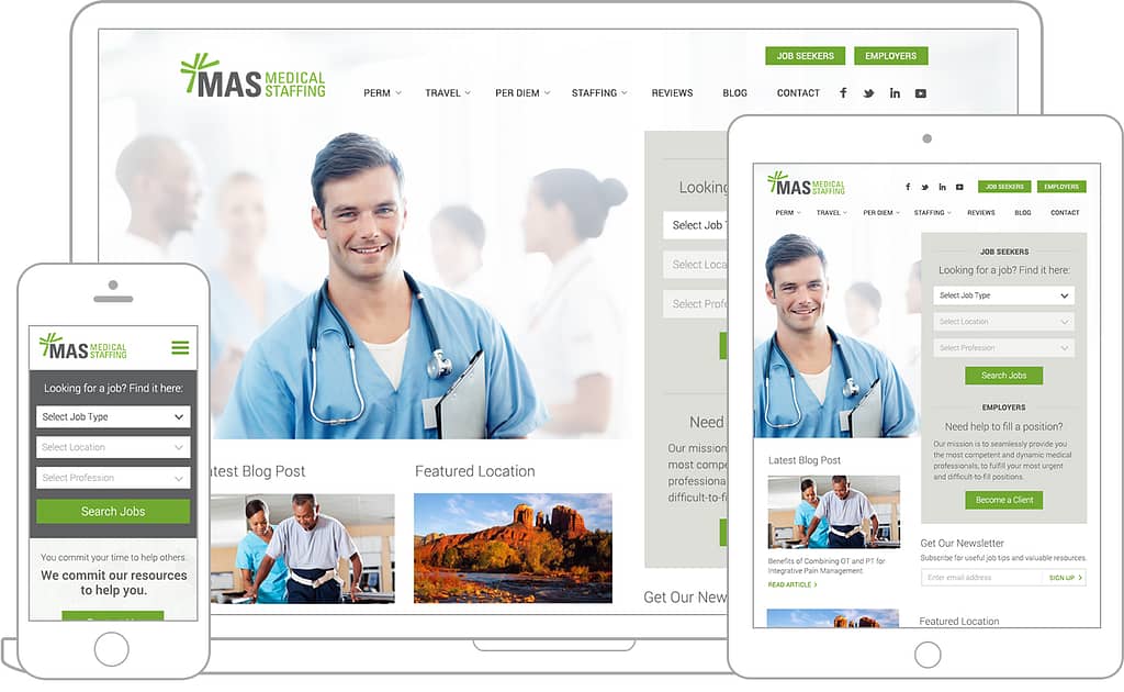
The mobile-friendly design ensures that your website works smoothly on all devices, especially smaller screens like smartphones and tablets. This means text is readable without zooming, buttons are easy to tap, and images fit the screen perfectly.
Key Principles of Mobile-Friendly Websites
- Responsive layout: The design adjusts automatically to different screen sizes.
- Easy navigation: Menus and links should be intuitive.
- Fast loading speed: Mobile users won’t wait for slow pages.
Why Mobile-Friendly Websites Matter
Impact on User Experience
Nobody likes a website that’s hard to navigate or slow to load. A bad mobile experience drives users away and hurts your brand’s credibility.
Influence on SEO Rankings
Google’s mobile-first indexing means that the performance of your mobile site directly impacts your search rankings. A mobile-friendly site can significantly boost your visibility and organic traffic.
Responsive Web Design
Definition and Benefits
Responsive web design (RWD) uses flexible layouts that adapt to different devices. It’s cost-effective, future-proof, and enhances user experience.
Examples of Responsive Design Tools
- Bootstrap: A powerful framework for responsive design.
- Foundation: Great for creating adaptive websites.
Optimize Your Website for Speed
Why Speed Matters
A one-second delay in page loading time can decrease conversions by 7%. Mobile users expect fast-loading sites and slow speeds can tank your traffic.
Tools to Test Website Speed
Discover Google Page Speed Insights, a fantastic free tool designed to help you analyze and enhance your website’s speed. Give it a try and unlock the potential for a faster, more efficient online experience!
GTmetrix: Offers detailed speed optimization suggestions.
Use Mobile-Friendly Themes and Templates
Benefits of Mobile-Optimized Themes
Mobile-friendly themes ensure your website’s layout and features are compatible with smartphones. They save time and provide a polished look right out of the box.
Popular Theme Options for WordPress
- Astra: Lightweight and customizable.
- Generate Press: Ideal for speed and simplicity.
Simplify Navigation
Importance of Easy Navigation
Mobile users need to find information quickly. Confusing menus and endless scrolling can frustrate visitors and drive them away.
Best Practices for Mobile Menus
- Use a simple hamburger menu.
- Limit menu items to essential pages.
Optimize Images for Mobile
Why Image Optimization is Crucial
Large images slow down your site. Optimizing images reduces load times and improves the user experience.
Tools to Compress and Resize Images
- Tiny PNG: Compresses images without losing quality.
- ImageOptim: Ideal for bulk image compression.
Implement Mobile-Friendly Fonts
Choosing the Right Font Size and Type
Fonts should be readable without zooming. A minimum font size of 16px works well for mobile screens.
Tips for Readability on Small Screens
- Use sans-serif fonts like Arial or Roboto.
- Avoid decorative fonts that are hard to read.
Test for Mobile Compatibility
Tools to Check Mobile Compatibility
Discover how user-friendly your page is for mobile visitors with Google’s Mobile-Friendly Test! This handy tool evaluates the ease with which users can navigate your site on their smartphones, ensuring a seamless experience no matter where they are.
BrowserStack: Simulates various devices and browsers.
How to Fix Common Issues
- Adjust font sizes.
- Ensure buttons are tappable.
- Remove intrusive pop-ups.
Enable Accelerated Mobile Pages (AMP)
What is AMP?
AMP is a Google-backed project that creates lightweight pages for faster loading.
Benefits of Implementing AMP
- Faster load times: Keeps users engaged.
- Improved SEO: Google favors AMP-enabled sites.
Leverage Mobile-Specific Features
Click-to-Call Buttons
Make it easy for users to contact you. A click-to-call button improves conversions for businesses.
Geolocation Services
Use geolocation to offer personalized content or directions. It’s great for local businesses targeting nearby customers.
Use Media Queries in CSS
How Media Queries Work
- Media queries allow you to apply specific styles based on screen size.
- Examples of Mobile-Specific CSS Rules
- @media (max-width: 768px) {
body {
font-size: 14px;
}
}
- @media (max-width: 768px) {
Prioritize Content for Mobile Users
Adapting Content for Mobile Consumption
Mobile users prefer concise, actionable content. Stick to short paragraphs and bullet points for better readability.
Strategies for Concise and Effective Content
- Use headers and subheaders.
- Avoid long-winded explanations.
Monitor and Update Regularly
Importance of Ongoing Maintenance
Technology changes fast. Regular updates keep your website relevant and user-friendly.
Tools for Monitoring Mobile Performance
- Google Analytics: Tracks mobile traffic and behavior.
- Hotjar: Provides heatmaps to analyze user interaction.
Conclusion
Ensuring that your website is mobile-friendly is essential; it is no longer an option. From improving user experience to boosting your SEO rankings, the benefits are clear. Start small, implement changes step by step, and watch your site thrive in a mobile-first world.
FAQs
How do I know if my site is mobile-friendly?
Use Google’s Mobile-Friendly Test to check your site’s compatibility with mobile devices.
What is the best tool for testing mobile compatibility?
Google Page Speed Insights and BrowserStack are excellent tools for testing.
Do I need AMP for my website?
AMP helps speed up your site but isn’t mandatory. Consider it if you prioritize mobile speed.
How often should I update my website for mobile users?
Regularly check your site’s performance and update at least once every quarter.
Can I make an existing site mobile-friendly?
Yes! Implement responsive design, optimize images, and test compatibility to transform your site.